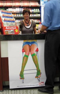


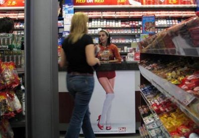
 Here is another smart guerilla campaign where posters of sexy legs were posted on counters, cashiers etc. to promote Che, a magazine for men.
20061028
sexy legs
Loaded by
The Zone
at
7:22 AM
0
comments
![]()
![]()
click on ambient media, guerrilla advertising, press
20061026
SHOOT ME or HIT IT

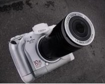
 Another amazing and smart guerilla ad for Canon S1.
Wish we can see in Kuwait's streets, very soon, such creative and innovative ideas. What does it take to conceive and initiate such concepts?
Especially that nowadays, Guerilla advertising is invading loads of countries.
It seems to be the latest trend. But in all cases we would be followers, imitators; that's the way it is! nevertheless a rockin' idea would spare you the "hey, it's about time"; or "Ha, they copied this, they copied that" etc.
Just a reminder: this is not a new mean of advertsing but it is somehow new and is called AMBIENT MEDIA. Google the word to learn more and preferably, apply the strategy.
Thanking in advance every creative mind working in an ad agency in Kuwait for the much needed effort to challenge the classical way of doing things.
Yalla!!! ENOUGH dullness, time for enthrallment to seduce your target. It's time to fascinate the consumer, to captivate your audience, to please, i mean PLEASE your client. Time for some enchantment in advertising; time to make us reconciliate with this industry coz believe it or not it's loosing its credibility BIG TIME, and in Kuwait more than any other place. We want to yell a WOW at every corner of a street. Y NOT? How impossible is that?? We have great creative minds, that is certain; but Y do they look handcuffed, debilitated by some mysterious reasons? PLEASE HELP liberate the minds!! :))
P.S: This blog is made for your inspiration and aspiration... HIT IT!!
Loaded by
The Zone
at
10:06 AM
3
comments
![]()
![]()
click on guerrilla advertising, public awareness
20061025
Homeless on the sidewalks


 An excellent guerrilla tactic that falls under ambient marketing - advertising that blends in our surroundings- for Médecins Sans Frontières.
Copy reads" every winter, hundreds of homeless die on the sidewalks. React"
Loaded by
The Zone
at
12:04 PM
1 comments
![]()
![]()
click on ambient media, guerrilla advertising, public awareness
outside the box


 Belgian social campaign to encourage and stimulate more diverse voting during the elections. The problem in Belgium is that most people tend to vote for the typical, average, white male (of 40-50 years old), while the place has a multi-cultural society. Here is a campaign to make them "think outside the box"
Loaded by
The Zone
at
11:59 AM
0
comments
![]()
![]()
click on public awareness
7O OOO litres of paint

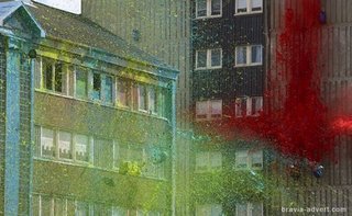
 Remember the Sony, Bravia campaign with its unforgettable bouncing balls, here is the new advert that combines 70,000 litres of paint, 358 single bottle bombs, 33 sextuple air cluster bombs, 22 Triple hung cluster bombs, 268 mortars, 33 Triple Mortars, 22 Double mortars, 358 meters of weld, 330 meters of steel pipe and 57 km of copper wire together.
The result: BRILLIANT!! http://www.bravia-advert.com/paint/thead/
Loaded by
The Zone
at
11:17 AM
1 comments
![]()
![]()
20061023
Pedestrian beware!


 Good stuff and quite impactful thanks to the 1st effect it leaves and affect at 1st sight. You just feel the urge to go deeper and try to decipher the message.
"Not every driver can spot you in time. Especially at night, look before you cross"
Campaign for pedestrians' awareness by Ad Planet, Singapore - Leo Teck Chong (Creative Director) - Alfred Teo (Associate CD / Copywriter)
Loaded by
The Zone
at
2:38 PM
0
comments
![]()
![]()
click on ambient media, print, public awareness, road safety
wine made of


 A wine ad?! yes and a Spanish one! but what does it say about the wine itself, its taste, its origin? Certainly not much; although it's very well art directed & quite appealing hence unforgettable. Still, is it enough to sell a product?
+ What's the point in the use of a grape branch to pattern an animal; what's the link between a fish or a cow and the wine? not an easy guess!! Does anybody know?
Agency: Tandem Campmany Guasch DDB, Spain // Creative Director: David Guimaraes // Copywriter: Xavi Valero
More car ads


 Copy reads "Calculate the intensity of the impact" .
This campaign for Megane cars is very much consubstantial to the Smith & Wesson one featured below ; it also resembles the wine ad above and is quite similar, in its approach, to the Animal protection campaign posted above too.
What do you think? Great minds think alike! Do they?
Loaded by
The Zone
at
3:08 AM
0
comments
![]()
![]()
click on automotive, illustration in advertising, print
Fun all the way
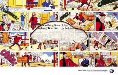

 "Fun on the outside, serious underneath" reads the copy.
One fresh imaginative campaign, quite old though, for Beetle cars that manages to portrait VW spirit. The focus is not on the car, rather these ads just communicate the mindtrip of VW drivers.
Honestly... It kills us not to be able to see such car adverts in Kuwait where it's often an image of the car taken from a catalogue along with its price and a lot of blahblah that accompanies it, basically an essay written about the car specs with a cliché slogan. Deadly communication!!
Loaded by
The Zone
at
1:47 AM
0
comments
![]()
![]()
click on automotive, illustration in advertising, print, VW
ARTVERTISING

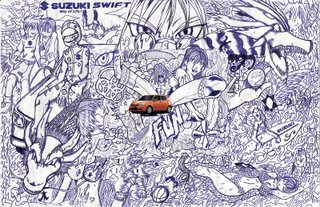


 Here are two different campaigns ("go-playground"; "wanna play") for Suzuki/Swift cars (by Pagès BBDO-Dominican Republic) where photoshop has been ditched to welcome a very interesting drawing. Try to look deeper to fetch for the details - click on image for a larger picture; it's quite pleasurable as well as cheerful plus you get really hooked... "Wanna play in that playground?" That's the Swift spirit and it's damn good!
Art in advertising is definetly taking the lead. However, these ads are very similar to Nike campaign posted on this blog down below and some others that we've seen and will get posted soon too. Though, it's quite normal that advertising finds inspiration from the arts and vice-versa..
Illustrator: Efrain Raymundo
Loaded by
The Zone
at
1:37 AM
0
comments
![]()
![]()
click on artvertising, automotive, BBDO, illustration, illustration in advertising, print
20061019
It could be so Glue
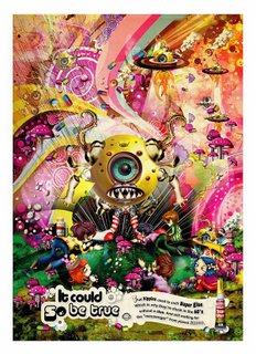

 By Leo Burnett- Singapore
Lately, we're seeing so many ads turning into one direction which is an artful one; whether mixed media, collages, painting, drawing you name it...It is confirming what we always believed in, Advertising is Art, Creativity is skilful, imaginative, Communication is nothing but art if you want it to stick in the mind of the consumer and trigger an emotional bond.
Couple of years ago, there were very clear lines between art & advertising. Nowadays, the trend has kind of forced the creatives to blur the lines to the point that it would be hard to leave that path. In fact, the industry as a whole ( not in Q8 though!!) has managed to marry this trend, creating an environment where increasingly, advertising imitates art.
Some ads are so artistic that you'd like to keep them, hang them as a piece of art. Subsequently, the main core of advertising that is to sell, would be attained since you get forcefully attached to the product through ART.
Will be posting more of those artsy adverts.. & you can scroll down to check out some others in that same spirit and feel such as Nike, EMI, Converse & more.
Loaded by
The Zone
at
2:49 AM
1 comments
![]()
![]()
click on leo burnett
Absolut ILLUSION


 Absolut Vodka ads always rocked... This is one campaign we like in particular... click on pix for a better view...
GAZE INTO THAT MAZE, IT'S MADE TO AMAZE!!!
Loaded by
The Zone
at
2:06 AM
0
comments
![]()
![]()
click on Absolut ads, alcohol, beverage, illustration in advertising, print
20061018
100 ABSOLUTES
 Is The Je Ne Sais Quoi the ABSOLUTE BAND NAME? Is San Francisco the ABSOLUTE CITY? And who has the ABSOLUTE NOSE?
THE 100 ABSOLUTES is a project for people with passions.
ABSOLUT VODKA is asking for nominations in loads of categories for a vote to start. Below is a few of the Absolutes stuff you can vote for...Nominate your favorite here
THE ABSOLUTE BAND - THE ABSOLUTE BLOG - THE ABSOLUTE DESIGNER - THE ABSOLUTE DIRECTOR - THE ABSOLUTE GAY ICON - THE ABSOLUTE HAIRCUT - THE ABSOLUTE HORROR MOVIE - THE ABSOLUTE IMAGE - THE ABSOLUTE JOB - THE ABSOLUTE JOURNALIST - THE ABSOLUTE LOVE SONG - THE ABSOLUTE MOVIE KISS - THE ABSOLUTE PAINTING - THE ABSOLUTE QUOTE - THE ABSOLUTE RESTAURANT - THE ABSOLUTE VICE - THE ABSOLUTE BAR - THE ABSOLUTE BURGER - THE ABSOLUTE CITY - THE ABSOLUTE COCKTAIL - THE ABSOLUTE EGO BOOSTER - THE ABSOLUTE FLOWER - THE ABSOLUTE HOTEL - THE ABSOLUTE INVENTION - THE ABSOLUTE JOKE - THE ABSOLUTE TATTOO - THE ABSOLUTE TECH GADGET - THE ABSOLUTE T-SHIRT PRINT - THE ABSOLUTE URBAN LEGEND - THE ABSOLUTE WALLPAPER - THE ABSOLUTE WRISTWATCH
By the beginning of 2007 the list of 100 ABSOLUTES will be complete.
Loaded by
The Zone
at
7:25 AM
0
comments
![]()
![]()
click on Absolut ads, tbwa
20061015
CHOC me apart
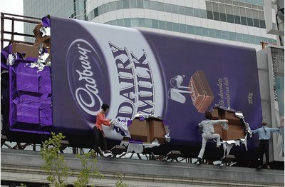

 That's what's called a guerrilla marketing approach for Cadbury chocolate in Toronto, Canada.
& that's what outdoor advertising should be ALL about! Rip you from bottom to top :)
Loaded by
The Zone
at
4:18 AM
0
comments
![]()
![]()
click on guerrilla advertising, outdoor
transparency all the way
 Here is an art project where the artist takes a picture of the landscape behind the billboard and then puts it on the billboard itself. Sharp, Smart & Stylish. Then here is a campaign for Amnesty Intl. in Estonia that uses that same concept in another clever way and is possibly maybe inspired from the project above.
 & then there is some transparent laptop screens. Amazing photography & photoshop work. TRICKY, you bet!!

 You can view loads more here
Loaded by
The Zone
at
3:24 AM
1 comments
![]()
![]()
click on photography

