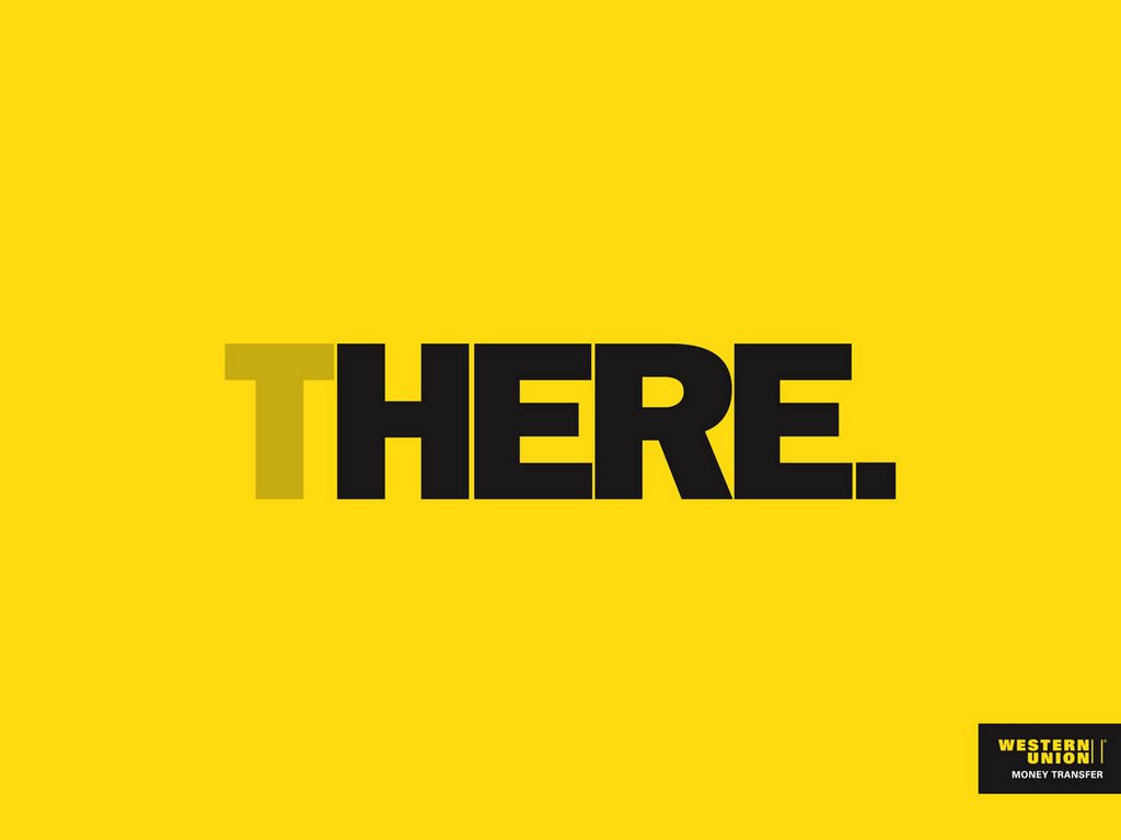
 By Saatchi & Saatchi-Beirut for Western Union.
Well it's clear, simple & straight!!
By Saatchi & Saatchi-Beirut for Western Union.
Well it's clear, simple & straight!!
20060222
Subscribe to:
Post Comments (Atom)
ArabAd Peace Poster Design Contest

This is ArabAd magazine's blog. If you got a taste for creative communications, then take an inspiring dive into ArabAd's Zone. Reprogram your Mind.. "Let your fingers do the walking".."SNAP! CRACKLE!POP!" It's ARABAD guilty feasts; a space for creative relaxation & inspiration around sparkling ideas. Allow unexpected connections to prompt new insights. Have a delightful surf. Seatbelts are optional. & keep in mind, It's all about the "Smile in the Mind".
By Saatchi & Saatchi-Beirut for Western Union.
Well it's clear, simple & straight!!
Loaded by
The Zone
at
5:05 AM
![]()
![]()
click on saatchi and saatchi

2 comments:
It's missing some "SIGNATURE" on it, (check out publicis-india's campaign). This one's easily done. Could've been better. I will give it a 3-star (out of 10) rating though :-)
Mr. Brain
I agree. The branding is awful. With a plain font like that and the yellow that is used by many companies, this ad needs more. Probably part of a larger campaign which helps the lack of branding.
Post a Comment